Another Post in Our Series of DIY Consulting Tools We Share Every Other Tuesday!
 Run charts are simple graphs you can use to track a process or activity over time in order to identify trends or shifts.
Although you could display the data you collect in another form, a run chart is easy to use and understand.
In addition, a run chart shows the interrelation of data points, compares the values of data points over time, and helps you identify the normal variation of a process or activity.
The horizontal axis measures time, and the vertical axis represents the frequency of some event. Plot information you collect about a process or activity as data points on the graph.
Overview of the Run Chart Tool
Run charts are often used by organizations to post sales, revenue, profit, etc. for all to see. However, you can creatively use a run chart to track any type of business activity. It can also be used to track the results of any business decision over time.
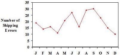
Here’s an example of a run chart used to track customer service. The shipping department of a company is trying to reduce shipping errors. 
To get a picture of past performance and isolate problem areas, the shipping supervisor created this run chart to analyze shipping errors over a one-year period.
To Use This Tool
- Determine the countable data you intend to gather. For example, you might count the occurrences of a particular problem over six months or a year.
- Collect the data using a check sheet or other counting method.
- Determine the X and Y coordinates on your chart. For example, the bottom portion of the chart usually shows time: hours, days of the week, or months. The vertical axis usually shows level of the occurrence you are counting (i.e., the average temperature of a product).
- Chart the data you collect by marking a dot where the X and Y axis meet.
- Connect the dots to show the trend.
- Analyze the information you have plotted for changes and trends.
Use This tool When
- You need to spot trends in a process or activity.
- You want to see the results of a change in a process.
To Learn More
We recommend the following book for those of you interested in learning more:
- Guide to Quality Control by K. Ishikawa.
Helpful Hints
- Chart your data in the order it was collected.
- Record data as numbers, averages, or percentages.
- Focus on long-term changes; not every variation is important.
For the month of August, Najera Consulting Group will be conducting Free 1 Hour Strategy Sessions for a limited number of owners of small to medium sized businesses and non-profit executive directors.
Schedule Your Session Today and:
• Gain better clarity of your organization’s vision.
• Uncover hidden challenges and blind spots that could be sabotaging your success
• Leave this session renewed, inspired, and re-energized about your business or non-profit.
Space is Limited. Click here to contact us with the subject line, “Free Strategy Session” or call: 630-326-3238
 About the Author:
Gabriel Najera is the president & founder of the Najera Consulting Group. Gabriel is a frequent speaker to organizations. And, is a highly sought after advisor to corporate and nonprofit executives looking to develop a strategic thinking mindset.
Gabriel is the author of the forthcoming book, Lessons From the Field: From Farmworker to Fortune 500 Consultant. Gabriel is available to speak to your organization. To inquire about scheduling Gabriel for an upcoming speaking engagement or to inquire about our consulting services, please click on this link.


Sorry, the comment form is closed at this time.